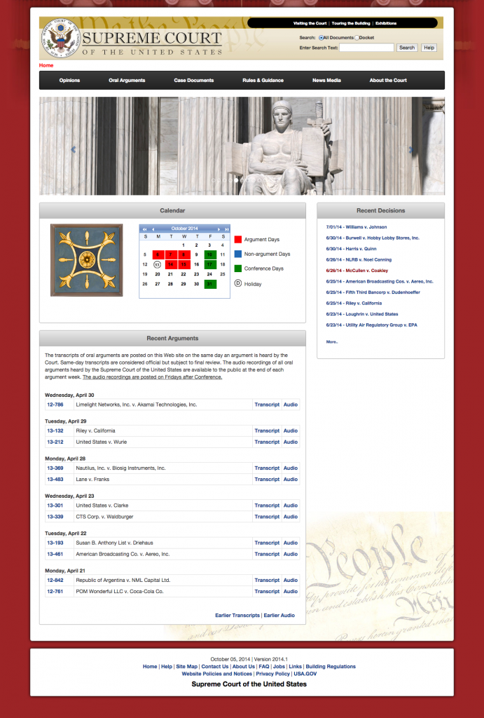
I am a fan of the redesigned SupremeCourt.gov. The logo at the top is very fitting. A faded “We the People” is dwarfed by the Supreme Court’s regal seal. All jokes aside, the Court’s tech team should be commended for a job well done. Rather than having the menus on the side, now we have the main items with a drop-down menu. The slide show below it should have a start/stop button. I really like the Greek columns at the top, with the curtains faded. It’s a nice accent. The links to transcript and audio on the home page are really helpful.
