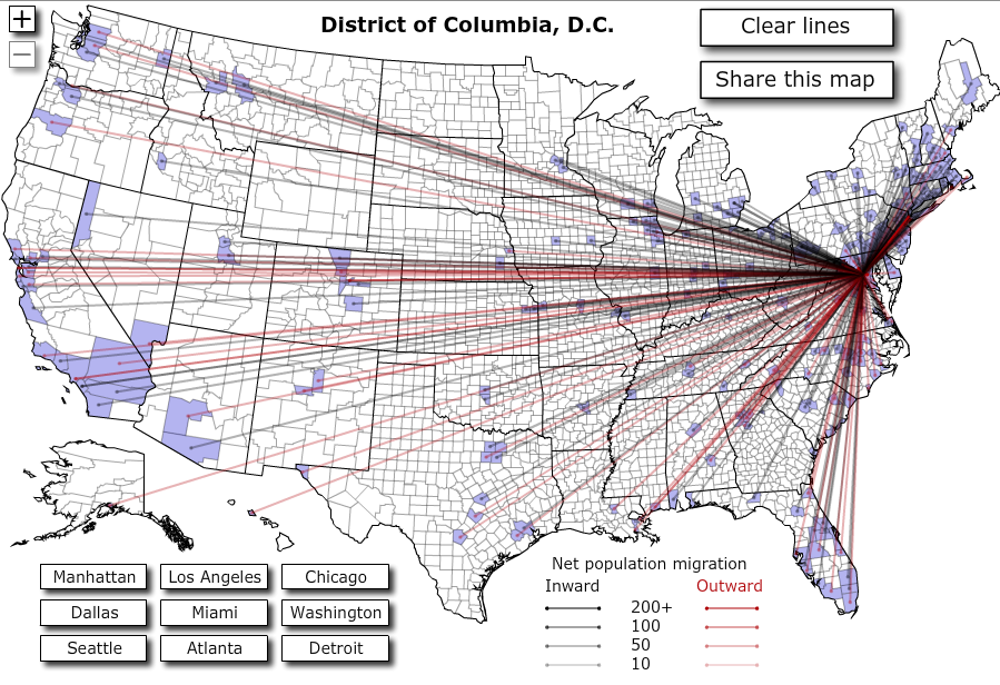
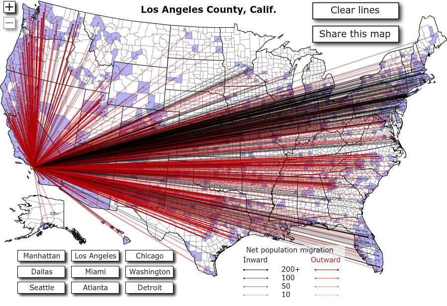
Forbes has a cool feature that graphically illustrates how many people left, and moved to, a certain city based on 2008 IRS data. Compare the influx to Washington, D.C. with the massive exodus from Los Angeles.
Update: I changed the title of this post (it was “voting with your feet, visualized”) as these numbers do not necessarily represent voting with your feet.

